Best Logos
A Casa is an association for domestic healthcare. I think this logo portrays both healthcare and domesticity subtly and accurately. While not using the screaming red cross that is usually associated with anything medical, A Casa opted for creating only the outline of a cross in a subdued shade of green. The association saved the alarming red to highlight the stroke in the cross that forms a rooftop of a house, which alludes to the domestic aspect of A Casa. The logo remains simple, yet gets the point across easily, while also representing both sides of the association.

BB Neon is a company that makes neon signs which you can easily infer from their logo. Some may argue that the BB part of the logo looks like bubble letters we drew in fourth grade but rest of the image refutes that with its inclusion of a border that closely resembles the lights on a neon sign. I think what is admirable about this logo is that the viewer can easily sense that it's a neon sign despite the fact that it's in black and white. You didn't need a bunch of lights to tell you what they do. Mission accomplished.
I've always loved the Chick-Fil-A logo because why not? The logo does not only stand strong on it's own, but it also fits flawlessly into the name. Chick-Fil-A managed to create an image out of one letter. The "chicken elements" that are added to the "C" are simple and tell you directly what they serve. Their use of the color red is effective because it is known to cause hunger and promote the sense of urgency. What more do you need for a fast-food restaurant?
iheartradio. The name is comprised of three words and all three of those words appear in their logo without making you feel as though you got caught in an image hurricane. You see the heart. You see the "i" which can double as the figure of a person. AND you get signal symbols to represent the radio aspect. All of this is made into a cute simple image that you see everywhere and immediately know who it belongs to. It doesn't get more effective than that.
Joybird Furniture's logo showcases the power of simplicity. It's a furniture store and it's represented by a bird, that also forms a chair. Clean and direct.
Worst Logos
A&G Roofing has a logo that gets the idea of roofing across but it is way overdone. The use of a gradient within the letters almost makes them get lost. The font used in "roofing" is overwhelming and difficult to read if the logo were to be scaled down in size. There's also a roof above the "G" and a house behind the "A." It seems a bit redundant.
Creative Boutique's logo uses clear type that is legible but what is the image above it? It's not clear and I couldn't tell you what the company does or what their aesthetic is by just looking at it which kind of proves its ineffectiveness.
B&M DryWall, once again, shows the complications drop shadows and gradients cause when made smaller. If this logo were made any smaller, the "M" would not be legible.
The company is called AZ Sports and I wouldn't have known that had it not been for the website listed at the bottom. I think the blue "A's" were supposed be bowling pins and the black circle is supposed to be a bowling ball. I'm not sure.
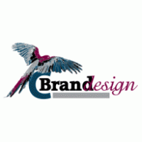
C Brand Design has a parrot in its logo and I don't know why. I don't know why the "D" in "design" is overlapping with the "D" in "brand." It looks messy and the shared letter concept could have been a bit more innovative.


-copy-copy.jpg)
-copy-copy2.jpg)


