Friday, September 18, 2015

What I Collect


There's nothing I like more than watching music videos. This is the single video that has inspired me to use more color in my work. I was starting to get into a straight black and white phase (which I am still kind of in), but this video's overwhelming use of color is fun, and vibrant.


Art toys have always been very interesting to me. I hope one day I can design one. These cool figurines inspire me to explore outside of just designing to print on a flat surface.


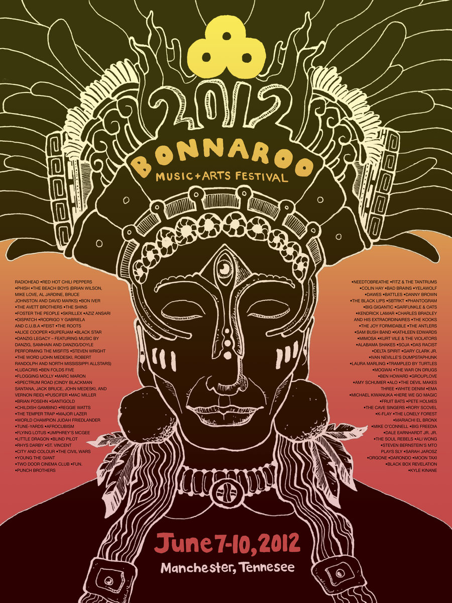
If there is one thing I will splurge on it will be music festivals and concerts. I can't count all of the shows I've been to on two hands or four of them. Music festival posters and memorabilia usually have a care-free and loose look. These posters loosen me up to not make design be so serious.  


I love the new direction typography is going in. It is no longer just a bunch of letters. It can be conceptual now too. It makes for great art.

Inspiration

When it comes to who inspires me, the list goes on and on. My family inspires me to be a better person, my boyfriend inspires me to be more loving and considerate, and Björk, musician and artist inspires me to be more creative. As far as design goes, wow, the options are endless. So to keep things short, I am currently inspired by Alex Kirzhner, like I mentioned previously. He moves through photography, illustration, and typography with such an equal amount of fluidity. I believe I can find inspiration in everything. I am an over-thinker which most of the times works against me but in this case, it helps. I find a lot of my inspiration in music. My freshman year of college I went through a phase where I would put headphones on and listened to music that had no lyrics. I would draw what the sounds looked like to me. That's the beauty in art. It allows you to cross your senses together. I can't see sounds but I know what they look like. That probably sounds really weird. I am definitely the most creative in the morning before the sun wakes up. This is new to me because my best ideas used to come at 4 AM. I think design is so much more than visual communication now. Although most of it is trying to say something, there are many times people design just for the aesthetics and that's okay! A piece can be visually stunning and have absolutely no meaning behind it. I think that's part of what makes design so much more flexible now. Here are the pieces that inspire me right now:


Thursday, September 17, 2015

My Self-Portrait + My Timeline

Overall, I was quite pleased with the results of my double-page spread and timeline. The only thing I will change is removing the "10 on 10" at the top of my timeline and write "The Life and Times of Betsy Cruz" in the same handwriting as my name in the double page spread. Out of all the pieces I've done at my time here, this one has been the most natural to me.


Monday, September 7, 2015

My Loves + My Hates

I can't help but think to myself that the timing for taking the Advanced Typography course couldn't be better. Why? This summer, I realized: TYPOGRAPHY IS EVERYTHING. I mean, the typography bug really bit me. Anytime I wasn't at work, I was endlessly scrolling through pages and pages of typefaces. The interior design bug bit me too. I always knew my love for drawing and painting would combine easily with graphic design but I never in a million years thought my random love for home decor would. I am so inspired by Scandinavian design in particular, it's minimalistic but statement pieces are living example of good design. Besides those two disciplines, I have discovered that album art is something that I would love to do as a career. I recently discovered Alex Kirzhner, who has received Grammy nominations for outstanding work in album design and limited edition packaging. Here are a few examples of what I believe is good design based on my summer interests.


Unfortunately my eyes have also feasted upon some terrible design. Working as a production artist at a t-shirt company, I have noticed that the general public isn't exactly aware of good kerning. I have also not been a fan of these fitness ads that I have been seeing on Pinterest. My feed is flooded with images of butts with hot pink borders. And finally, I have learned that I have to warm up to the concept of corporate-esque (?) flyers/informational packets. I just believe there's a more modern way to do corporate design now a days.


Thursday, August 27, 2015

My Portfolio MVPs

Here's what I believe were the key ingredients to my portfolio:


My Personal Logo
I was very satisfied with my logo since the day I made it because I believe it describes me perfectly. The words I chose to describe me were "minimalist" and "intimate." The design is not extravagant or too decorative. It was minimal. The C is also incorporated into the B making it one entity, showing the idea of intimacy

Of course with all strengths come weaknesses. I thought perhaps the logo may come across too simple. I also felt like it was extremely "corporate" in comparison to what I normally like to do.


1984 Book Cover
I think that my book cover accurately depicts the story of Winston Smith not fitting in with the dystopian society that he lives in by severing him from the paper people chain. The back cover portrays how he feels like the shell of who he used to be.

The cover could have been improved by fixing alignment issues with the synopsis on the back cover being too close to the edge. I also felt that the red lines should have had more purpose and looking back on it now, I find them to be a little distracting.


Get Rad Earth Day Poster
Overall, I sense that my Get Rad branding project encompassed a lot of my greatest hit, my earth day poster being one of them. It's cleanliness and copy contributed to it's success in my eyes.

I think I could have made "Melt faces" fit onto one black slab as well as the bottom text. The four slabs make for awkward space.


Get Rad Client Logo

The success of my client logo could be due to its fidelity to Get Rad's raw style, which caters to skateboarders.

I did, however, have trouble with the division of the image because it didn't line up perfectly.


Expressive Type Quote

I think this project's strength comes from the accurate depiction of boring (through the bullets of text) and interesting ("Enthrall the with story"). 

I thought that maybe a weakness could have been the color selection. I felt like it was a bit too "fall" for me but I figured I would experiment more with warm colors and expand my color selections.


Tuesday, May 5, 2015